
Algorithms are the Oracles of our Age
It's no longer the answer which is unintelligible, but the question

TL;DR: please watch this video, for its full duration, and share it widely. It should be getting many more views than it’s managed to achieve. If you watch it, your time might translate into many more views for what I regard as one of my most important videos ever.
The rest of this post is my winge about how our lives are ruled these days by mysterious algorithms which make the oracles of the past look quite charming.
The Ancients used to consult Oracles to discern the will of the Gods. The trouble was that, though the answers (mythologically speaking) were true, they were delivered in such a cryptic manner that they could, and most often were, interpreted wrongly.
The classic oracular confusion in English literature was MacBeth’s consultation with the witches about his future as King. He was told that
Macbeth shall never vanquished be until
Great Birnam Wood to high Dunsinane Hill
Shall come against him
MacBeth took this as assurance that he would never be defeated. But in fact, “Great Birnam Wood to high Dunsinane Hill” did indeed come, as his enemies concealed themselves using branches from the trees of the Wood as cover in their advance on Dunsinane Hill.
Our modern Oracles are the algorithms which determine whether your Tweets go viral, or whether your YouTube video get seen. Frankly, I prefer the Oracles of old to these modern-day bastards. Rather than giving you a cryptic clue to a correct answer, today’s Oracles give you answers which make it impossible to know what question was asked of them. In modern parlance, some videos and tweets go viral, some fail abjectly, and no-one outside the algorithm authors themselves knows why one video booms and another bombs.
I’ve experienced this recently, when my video on Australia’s housing bubble “went viral”:
with close to half a million views in its first month. My team and I thought we’d finally cracked the visibility issue on YouTube, and from now on, the only way was up:
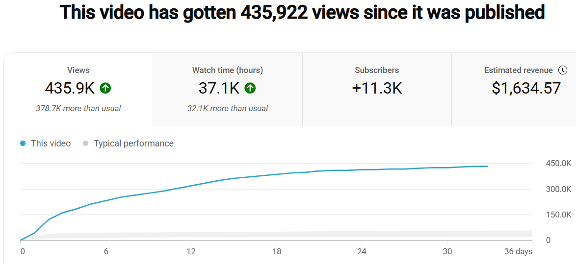
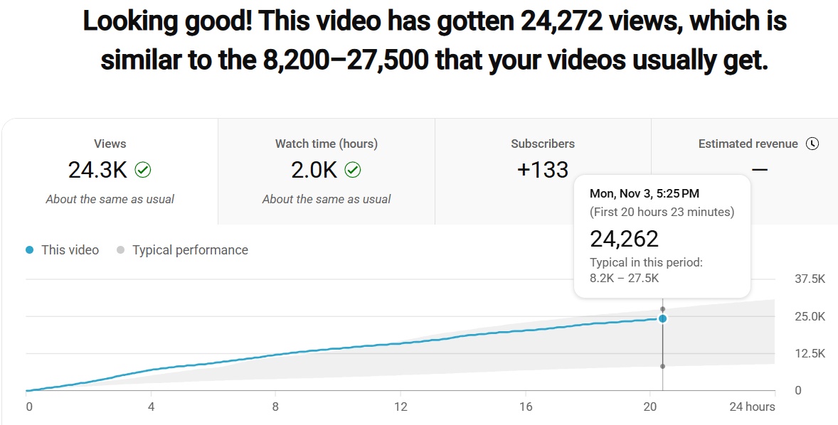
So much for that! We thought the next video on this front—about the UK housing bubble—would have to out-rate this Australian-focused video, simply since the UK has twice as many people as Australia. But comparatively, it bombed. The grey band in the next plot is the same scale as the one in the previous video. It had 24,000 views in its first day, compared to 44,000 for the Australian video. The UK video’s views remained in the grey band, whereas the previous Australian one—which we thought would have less appeal—towers over the grey band.
If anyone has a clue as to why these idiosyncracies apply, please let us know. In the meantime, do what you can to help the Oracles lean in my direction by watching this video and sharing it around widely.
“Algorithms are the Oracles of our Age”, but bad videos are no help either.
Unintelligible answer ¬
- Cyclically Adjusted Prticed to Earnings Ratio (CAPE)
- Margin Debt
- Change in CAPE vs Change in Margin Debt
- at 8m.19
You say, “Margin debt is at its highest level since the Great Depression” – yes, if you look at the top left chart, and then you say but that is CAPE not debt. And then you look at the top right, and ask yourself, what is Margin Debt, anyway ? And the bottom chart is not a proof of anything if one cannot understand it.
So ten minutes later I can probably make sense of these charts. But if all I have time for is a quick glance at the big chart on the bottom, all I can see is that two unknown series are moving roughly simultaneously, which tells me nothing about high debt.
You then say, “Stock markets are at their highest level since ……” but against the background of that same slide, not a chart of stock market prices so one starts trying to hunt round to see where stock market prices are, and stops listening.
On ancient jubilees, you start, at one point to say “the dangers of invasion..” but switch to “the jeopardy of invasion”: but “jeopardy” is a clumsier way of expressing threat, and is a less common word – so harder to understand in the first place and, to many, less meaningful. (in spite of tv games like “Jeopardy”).
And this Godley Table chart – Banks, at 11m 13 - is absolutely hopeless: it would take me 5 minutes to begin to make sense of what it was saying. And mostg people will never have heard of a Godley Table and would not know what to do what is being served up on it.